

In this section we will be taking that detailed look into Photoshop's Index Color Settings. There are not as many as we might think, but each setting has its own purpose. This short and sweet block of information will takes us through all of the settings and what they do. This section can be referred to for this info at any time. These are your notes! This will take us about 10 minutes to complete.
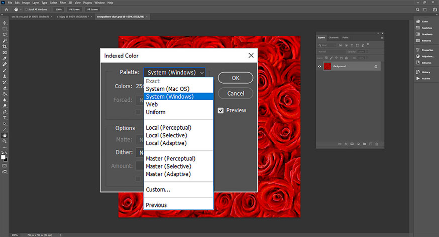
The Color Index settings are not readily visible. We must click the "dropdown" menu option so that we can see them. That would be the little chevron circled in red in the image below
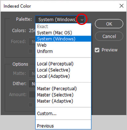
List of Photoshop's Index Color Settings
From the index color settings menu image shown above
Exact: If the RGB image contains 256 or fewer colors before converting to Index Colors, the Exact option lets you make a color table using those colors. The integrity of the image's appearance is retained. (Grayed out in the example image.)
System (Mac OS): The image's colors are converted to the Macintosh system's 8-bit palette.
System (Windows): The 8-bit standard Windows palette is used to produce the color table.
Web: The web-safe palette of 216 colors that are the same for both the Macintosh and Windows system palettes is used
Uniform:The color table is generated by acquiring samples from the RGB spectrum. Six evenly spaced values for red, green, and blue are taken: 6x6x6 = 216. If the total number of colors is limited to fewer than 216 in the dialog, the next smallest perfect cube (125, 64, 27, or 8) is used.
Perceptual: The color table is created, with emphasis on the colors for which the human eye has greatest sensitivity. (The Local option prioritizes colors within the image, and the Master option relies on the RGB gamut.)
Selective: Large areas of consistent color are used to create the palette with this option. Otherwise, the palette just follows the same guidelines as it would for Perceptual. The Selective does well in preserving an image's appearance.
Adaptive: An adaptive palette of color is created by using the colors that appear most frequently in the image. If the color of a specific area of the image is most important, you can use any selection tool to select an area of that color before converting and then choose Adaptive.
Custom: This option enables you to edit the color table directly. It opens with the adaptive palette. You also have the option to load a previously saved palette of color.
Previous: The most recently used custom palette is used to create the color table. This option enables you to convert numerous images using the same palette.
The difference between Local and Master for the Perceptual, Selective, and Adaptive options is most apparent when the color table is reduced from 256 to a smaller number of colors. The Local option places importance on the colors that exist in the image, whereas Master looks at the RGB gamut, also known as the range of colors that can be produced using the RGB color spectrum or model. Dithering can be especially important when using the Master options.
Dither is intentionally applied "noise" for the purpose of creating color transitions instead of "color banding".
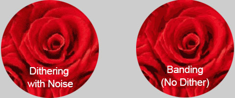
Depending upon the method of printing and the type of fabric being printed on, "Dithering" might not print correctly due to "dot gain" and various other factors.
Please know that color reduction is an iterative process. This means we must reduce the colors a few at a time. In the next section, Section 3, we will apply the first reduction in the process. We are going to use "presets" for the first reduction[s] so this will be a very quick and easy section for us to complete!