


It takes approximetly 10 minutes to review this material
“In color theory, color harmony refers to the property that certain aesthetically pleasing color combinations have. These combinations create pleasing contrasts and consonances that are said to be harmonious. These combinations can be of complementary colors, split-complementary colors, color triads, or analogous colors. Color harmony has been a topic of extensive study throughout history, but only since the Renaissance and the Scientific Revolution has it seen extensive codification. Artists and designers make use of these harmonies to achieve certain moods or aesthetics.” from wikipedia/eng/
The basic harmonies shown below are meant to be starting points for creating our own unique color arrangements or harmonies.
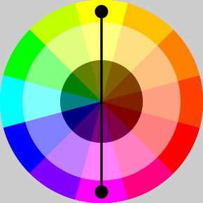
Complimentary Colors
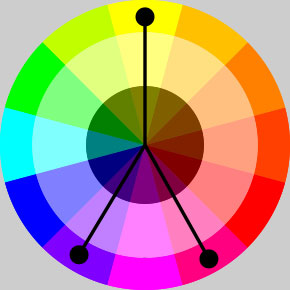
Split Complimentaries
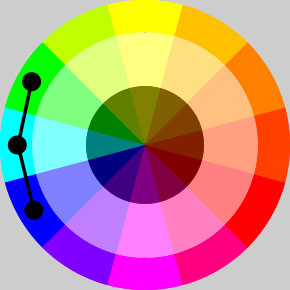
Analagous Colors
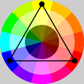
Triadic Colors
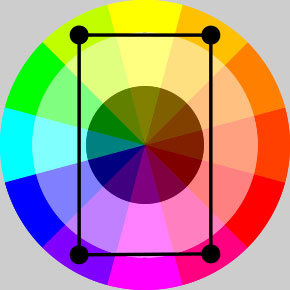
Tetradic Colors
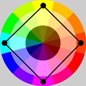
Quadratic Colors
The ratios below show a 1 to 1 relationship with the red and green, 3 to 1 with blue and orange and finally 4 to 1 with violet and yellow. These are from Johann Wolfgang von Goethe's Theory of Colours, (1810).
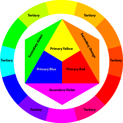
Like with the basic harmonies shown at the top of this page, these ratios are "starting points" from where we can make color design decisions. When we start to move away from primary and secondary colors and use tints and shades and tones, the ratios will change in different ways, some subtle while others can be more drastic.
In section 3 of the re-coloring sections, we will look at techniques for creating a harmonious color palette that can then be translated into a color table.