This content has been created exclusively for the University of New Mexico.
This content has been created exclusively for the University of New Mexico.
We will use Adobe Illustrator as a vehicle for learning repeats
This time! Next week we'll look at Photoshops' pattern/repeat making capabilities.
Read NDD Book Chapters 4, 5 & 6
We will be creating these using Adobe Illustrator
This is our intro to Adobe Photoshop
In this exercise, we will be using Adobe Photoshop as a vehicle for more exploration with color. This will also teach us about Layers, Layer Modes, Layer Groups, Adjustment Layers and some effects.


In this first video we will do a quick review of Adobe Photoshop's UI and toolset, along with some critical info that will help us avoid difficult problems within Photoshop.
This is the first of 3 step by step instructional videos that will guide us through the successful completion of the 'Painting with Light exercise.'
In this second video of three, we will start to apply the filters and layer structure that will comprise our Painting with Light composition.
In this final video section we will complete the colorization of the remaining layers - completing the Painting with Light exercise and composition.
Using Illustrator as opposed to InDesign will allow us to use the illustrative features that Illustrator provides without having to work with both programs. It is easy enough to work with both, but that creates additional work. There may be a client or employer that require this because of service bureau (printer) requirements but generally speaking, business cards are designed using Adobe Illustrator - "Should I design business cards in InDesign, Illustrator or Photoshop"? [article].
We will be working with a template that I revised for this class and purpose. The image shown below is a screenshot of that template.
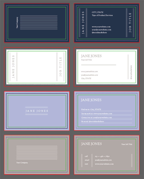
In this brief video, we will take a quick look at the template file we will be working with and best practices for using it. We will look at Artboards and how to manage them.
In this video section, we will look at using, finding and installing fonts.
This video will show us how to embellish our cards with motif[s] or artwork stored within Illustrator.
A quick tip I forgot to put in the last vid!
Adobe Illustrator provides some incredible methods for using the principle of repetition! We will go over some of these in this video.
In this video we will learn how to creat brushes. These are illustrative elements that repeat along a path.