This content has been created exclusively for the University of New Mexico.

This content has been created exclusively for the University of New Mexico.

By now we can see that the study of the elements and principles of design is not a linear path. We started with color in week 2, and here we are again! It will be a continuing process as we will be applying and using all of the elements and principles of design on all of our projects. Speaking of projects...
The Business ID model is our chief pursuit in addition to acquiring a level of proficiency with the major Adobe design programs; Photoshop, InDesign and Illustrator. Using the software to apply the design principles as we become more comfortable with them is ideal for the limited amount of time we have to accomplish all of this! Everything we do is designed to make this happen. The following list is representative of what we need to do;
Each of these projects has a relationship. That relationship requires that we develop these assets simultaneously. We will approach this in stages. Stage one of our business cards was last week. Stage 2 will consist of adding images to the background. We will need to start logo development this week too. There will be more work in Photoshop too, as we will learn some imaging techniques this week. This is geared towards completing our self-promo poster, which of course is a part of our business ID model. The rest of this weeks' exporation and adventure looks like this:
In this stage we will look at the use of images in this process. To be as successful as possible, we will be using Photoshop based image template files. Those files as well as the video instructions can be accessed below.
Phase 1 will consist of 'blocking out' or what is otherwise known as 'wire-framing' the layout for our resume. We will use Adobe Illustrator to accomplish this task. Video instructions can be accessed below.
In this exercise we will look at Adobe Illustrators' 3D effect module. This is a fun illustrative technique that will also help teach us about Illustrators' Appearance palette window as well. Video instructions can be accessed below.
Read NDD Book Chapters 7, 8 & 9
Color -
Our usual fare here - This is posted on the class LMS.
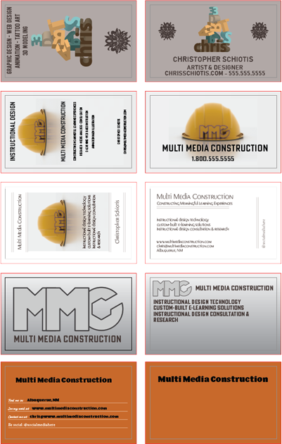
In the image above we can see that the text and most of the colors have been altered considerably compared to the original template. This is what will be expected of a successful effort on this project. In the demo/instructional video[s] below we will look at techniques for including images.
There are 2 .psd templates for us to work with. Please download them here:
Portrait Aspect - Landscape Aspect
This first video has important information! Please watch it!
Using a simple line we can very quickly create our own symbols.
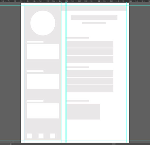
The image above shows an example of a wire-framed layout for a resume. We are going to be doing 4 of those this week! This is a method that is meant to enable us to quickly explore layout possiblities for our resume. We will later use one of the wireframes as a guide in InDesign.
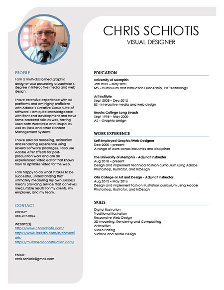
This is the resume that was created from the above wireframe:
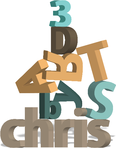
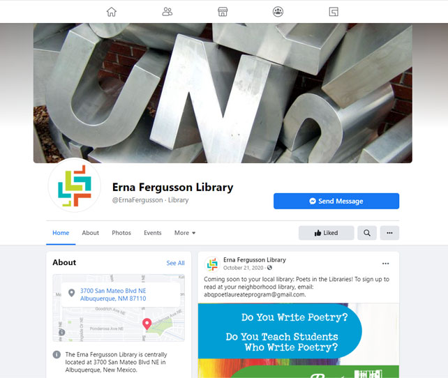
The Erna Fergusson Library has a beautiful sculpture garden there onsite within the building area. The text sculptures, especially the one on the center divide on San Mateo Blvd inspired this exercise. The challenge is to create your own sculpture, using any text you like. This can then be used as an illustration for many of our branding elements.
Arrange your 3D type in a creative fashion, but use the elements and principles of design to make it readable!
